On Vocal Type and the Power of the Pegasus

The Poetry Foundation’s creative director, Fred Sasaki, invited November 2022 cover artist, Tré Seals, to talk about his connection to the Pegasus typeface and designing the November cover, as well as his work at Vocal Type.

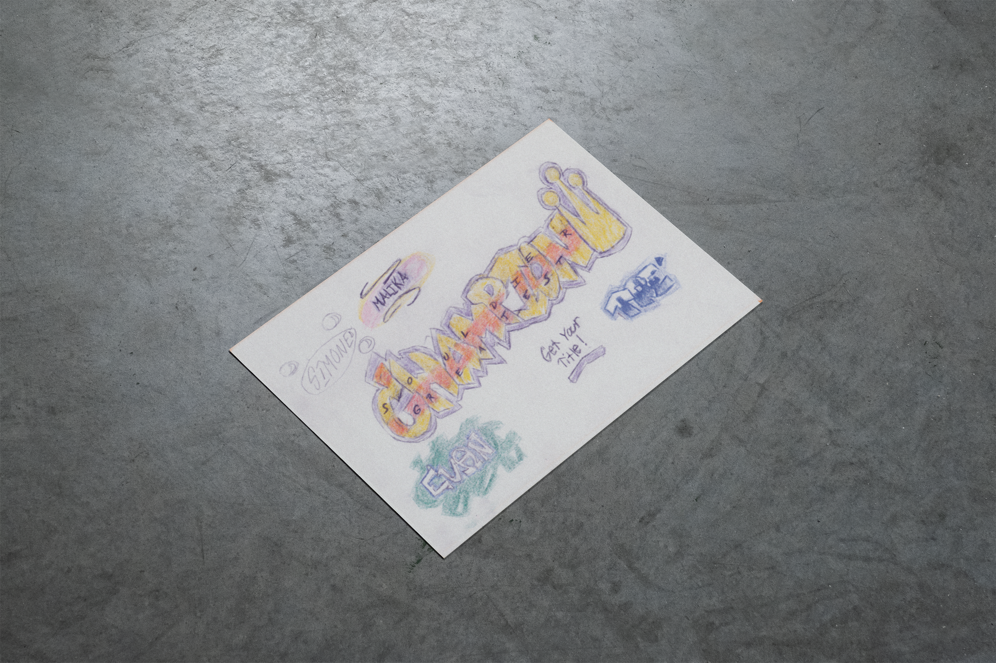
Most people know me as the founder of the diversity-driven font foundry, Vocal Type. However, I’ve been on a lifelong path when it comes to design. Since kindergarten, I’ve been practicing writing in cursive, which formed my love of letters and typography. By the time I was in the fifth grade, I had sold $3 graffiti-style name cards to my classmates. By middle school, I was designing tattoos, jewelry, and more. By twelfth grade, I had already begun creating my first font.
While my story doesn’t come close to ending there, I’d prefer to discuss how the November 2022 cover came to be. As a freshman Visual Communication Design major, I had a lot of opportunities to explore my tastes and style and decide whether or not I even wanted a style. I ended up deciding against it. I couldn’t see myself making one style of work and not being able to change. As I began to learn about typography, how to analyze it, how to use it, and so on, there was this ah-ha moment when I realized that different typefaces project different personalities, emotions, and messages. I’ve been obsessed with type ever since.
I’ll never forget the first typeface I fell in love with. It was called Albertus. Inspired by stone engravings, it had these sharp, prophetic features that simply captivated me. However, beyond the typeface, I was also intrigued by the designer, Berthold Wolpe. A Jewish type designer, Wolpe fled from Nazi Germany to live out the rest of his life in England. While in England, Wolpe became famous for designing typefaces and lettering book covers for Faber & Faber. As I explored his work, I came across this never-before-digitized typeface called Pegasus. It was a serif typeface (a typeface with small decorative strokes, called “serifs,” found at the end of horizontal and vertical lines), with this freedom I had not seen before. Usually, in type design, characters are made using other letters, so there’s some consistency. For example, “A” is traditionally made from “V.” Pegasus, however, ignores rules and uniformity for the sake of personality and freedom. With a mix of serifs and each character drawn differently from the next, it was a nice change of pace since I was taught that design had to be this perfect thing without personality. (Scroll down at this site to view the original Pegasus showings by Berthold Wolpe.)
It wasn’t until 2017 that a foundry, specifically Monotype™, digitized Pegasus. That made my year. To top it off, I was invited to create the banner for the Fonts.com™ homepage, announcing the release of Pegasus. My dad and I spray-painted a rubber Pegasus model for this banner and photographed it on a white backdrop. Unfortunately, the banner and photos were never used. However, thanks to Poetry magazine, I had the chance to revive that long-forgotten image, in combination with my interpretation of the Pegasus typeface for the cover of the November issue.

It wasn’t until I began working on this cover that I realized how much Pegasus (the typeface) has influenced my work. I founded Vocal Type in 2016 in response to the lack of diversity in the graphic design industry. Through Vocal, each typeface highlights the histories and progressive movements of different underrepresented cultures. Most commonly, my typefaces are based on protest signs, which are never meant to be perfect. Like Pegasus, uniformity cannot exist in a typeface inspired by humanity. That is revolutionary.
Tré Seals is a Washington, DC, designer and founder of Vocal Type Co.